YouTube Unveils a Bold New Look for Its Video Player
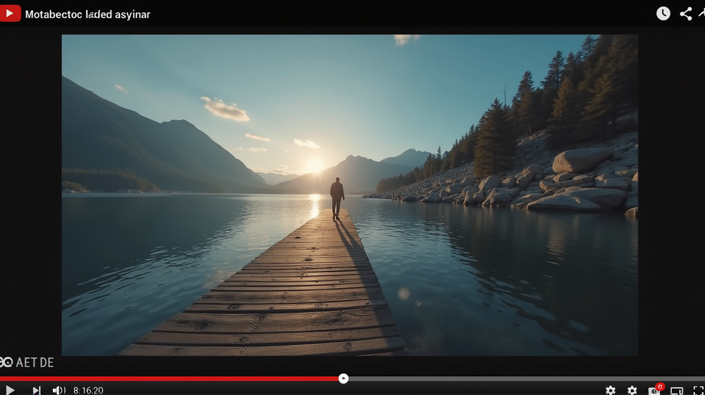
In a surprising yet exciting turn, YouTube has rolled out a new design for its video player, leaving many users both intrigued and perplexed. The redesign promises a “more expressive” and intuitive viewing experience, ensuring that technology and aesthetics walk hand in hand.
A Transformative Visual Experience
Gone are the days of a simplistic and straightforward video player. The new design introduces a bubbly and rounded style with larger buttons that blend transparency to reduce obtrusiveness. This shift aims to enhance the visual satisfaction of users, allowing them to focus better on the content they love to watch.
Universality Across Devices
The update isn’t limited to a single device—it spans the entire spectrum of platforms, including iOS, Android, web, and TV. Users viewing YouTube on their televisions will notice video details subtly shifting to the upper-left corner, a strategic placement to clear pathways for glorious visual engagement.
Ease of Navigation and Interaction
Among the innovative tweaks is a modernized double-tap feature for seeking. This improvement is designed to be less intrusive and more in harmony with the user interface. Additionally, comments and their replies have become more distinct and navigable, thanks to a revamped visual threading feature.
Embracing Change
While the updates do not revolutionize how YouTube functions, they inject new life into the world’s most beloved video platform. Subtle enough to avoid overwhelming users, these changes do just enough to intrigue and refresh the overall experience. As stated in Mashable, these strategic changes ensure that users have more reasons to enjoy their next video engagement.
As you explore YouTube’s new design, let it guide you into an era of visually delightful views and seamless interactions. Whether you’re watching the latest viral content or diving deep into informative lectures, this redesign is crafted to elevate every click, play, and comment you make on the platform.


